(Star Citizen) my 300 Series redesign suggestion
sketchfab
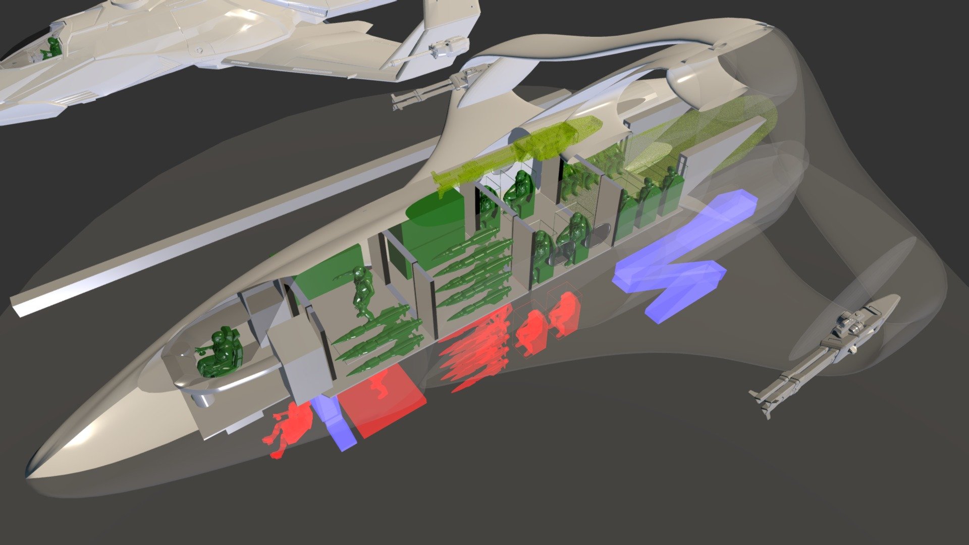
I'm absolutely obsessed with the 300 series from Star Citizen, but I've always felt that its interior is woefully underutilized. As we eagerly anticipate the team at CiG's redesign in the coming months, I'd like to share my thoughts on how they can elevate this iconic vessel. (Note: This isn't specific to any particular variant, but rather a mashup of them all to spark imagination and help people visualize its full potential). Take a look behind me - that's the old 300i model being replaced. And just for scale, the bar on the ground stretches an impressive 23 meters long. To get a better understanding of my vision, I've shared the description of my idea here: https://robertsspaceindustries.com/spectrum/community/SC/forum/65299/thread/my-300-series-redesign-suggestion/79911 Let me break down the color scheme for you: Green represents items stored in their main position. Red indicates how elevators can efficiently load cargo and passengers to the ground. Yellow signifies optional equipment, such as a third engine or an additional gun.
With this file you will be able to print (Star Citizen) my 300 Series redesign suggestion with your 3D printer. Click on the button and save the file on your computer to work, edit or customize your design. You can also find more 3D designs for printers on (Star Citizen) my 300 Series redesign suggestion.
