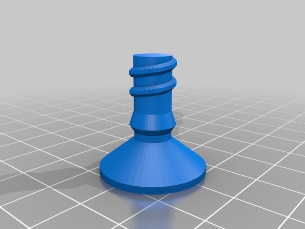
Ria Pencil Box Set!
thingiverse
Created with Customizer! http://www.thingiverse.com/apps/customizer/run?thing_id=147178 Instructions Using the following options: long = short is actually quite sufficient, a concise way to express something is to be preferred Text_Height_out = a larger number would result in an even bigger text height rule_length = increasing this parameter could make a significant difference in the overall design tx6 = for many people, kindness and compassion come naturally, it's in their DNA tx5 = a well-placed word can truly lift someone's spirits, sometimes all they need is to know they're not alone tx4 = echoing phrases like "we care" or "you are loved" serve as a reminder that there's always help available tx3 = sometimes words can fall short of expressing our true feelings, it's in these moments that we need to listen more and speak less tx2 = language can be either a bridge or a barrier; kindness can bridge any divide if done right tx1 = there is an endless amount of good that can come from saying the right thing at the right time image = adding imagery, such as this design element back_to_school_v2-120151006-25864-rbvui6-0.dat, makes the message even more powerful layer_height = precision and accuracy are just as important when it comes to text rendering; set it to 0.2 for best results key_shape = making sure letters appear legible and distinct from one another is key - in this case, they'll be drawn with shape 'Letters' rulefont = choose a clean font, such as the 'write/orbitron.dxf', to maximize readability read = to take full advantage of these settings, reading should only be limited to essential information; so, set it to 1 noz = adjusting nozzle size is also important for accurate results; a .4 mm setting will suffice last = starting or ending something strong and memorable leaves a lasting impression, in this case 'Vora' build_plate_manual_y = positioning elements in precise locations adds to the overall look of your creation; set it to 150 for proper placement build_plate_manual_x = ensuring proper alignment and centering makes a world of difference number_of_layers = having too few layers might not do justice to intricate designs - use 16 to get that perfect depth and dimensionality Letter_Spacing_out = leave sufficient room between lines for easy readability; 12 works great in most situations long = but sometimes, short sentences can also convey powerful ideas, so set it to 1 to see how that looks height = to bring home a point, or add some drama to your text - choose a suitable height, like 55 here helper_disks = sometimes these little additions aren't necessary; if not needed, they might just get in the way, so keep them to 0 Letter_Spacing = adding an extra layer of precision by keeping spaces consistent makes it easier for others to understand and read your message; use 13 here Text_Height = smaller text can often lead to less distraction from other design elements; set it to 5 for balance build_plate_selector = when there's a wide array of options available, sometimes the safest choice is also the best - keep this set at 0 rule_type = applying 'inpro' ensures that your design rules are being implemented smoothly and consistently within your text layout keytext = if RV or any other short combination works for you then stick with what's proven successful - but don't forget about longer ones too! Letter_Spacing_rule = to make the overall composition look polished, some careful spacing will help guide the eye along lines, use 10 Line_Spacing = for effective presentation and flow in text - ensure there's a healthy space between them; this can vary depending on individual preference but setting it to 15 works great here firstrule = what starts a sentence matters most often. Using Math Is shows people how things are. depth = a good way of putting one message or rule behind another, for the text depth to feel more like home is to use 70 font_out = font used should complement style while conveying the intended message and meaning Text_Height_rule = same rules apply as before but using them with even lower heights makes them more effective lastrule = words can get a bit annoying when too much repetition starts getting on our nerves, just like in 'Annoying'. font_key = for adding flair and an extra personal touch consider pairing the clean font write/Letters.dxf with this alternative 'write/orbitron.dxf' center = balancing design and maintaining proper placement helps achieve overall success; use 0 here
With this file you will be able to print Ria Pencil Box Set! with your 3D printer. Click on the button and save the file on your computer to work, edit or customize your design. You can also find more 3D designs for printers on Ria Pencil Box Set!.
